Auto Industry Analysis
Scenario
We’ll solve this scenario using IBM’s Cognos Analytics. We’ll analyze the historical trends in car sales for SwiftAuto Traders. The goal is to provide insights on car sales and profits for each dealer.
Tasks
Task 1
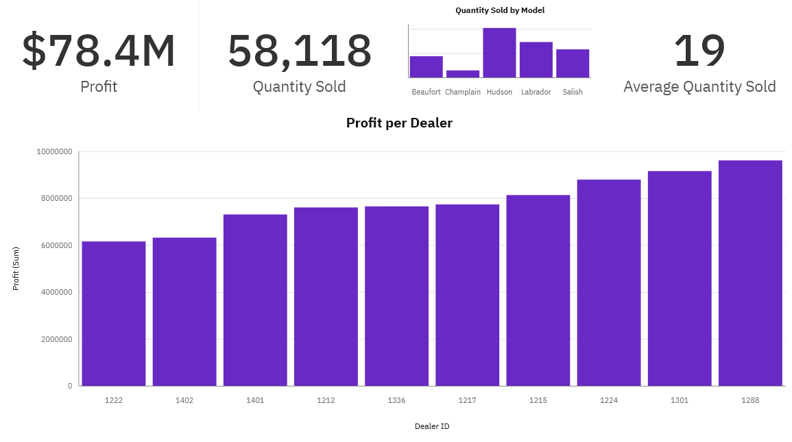
Create a dashboard/report page titled as Sales to capture the following KPI metrics:
- Capture Profit (formatted to 1 decimal place in millions of US dollars)
- Capture Quantity sold
- Create a bar chart to capture Quantity sold by model
- Capture Average quantity sold
Task 2
Develop a column chart to display Profit by Dealer ID in the Sales dashboard/report page sorted in ascending order.
Task 3
Create another dashboard/report page titled as Service and capture the following KPI metrics as visualizations:
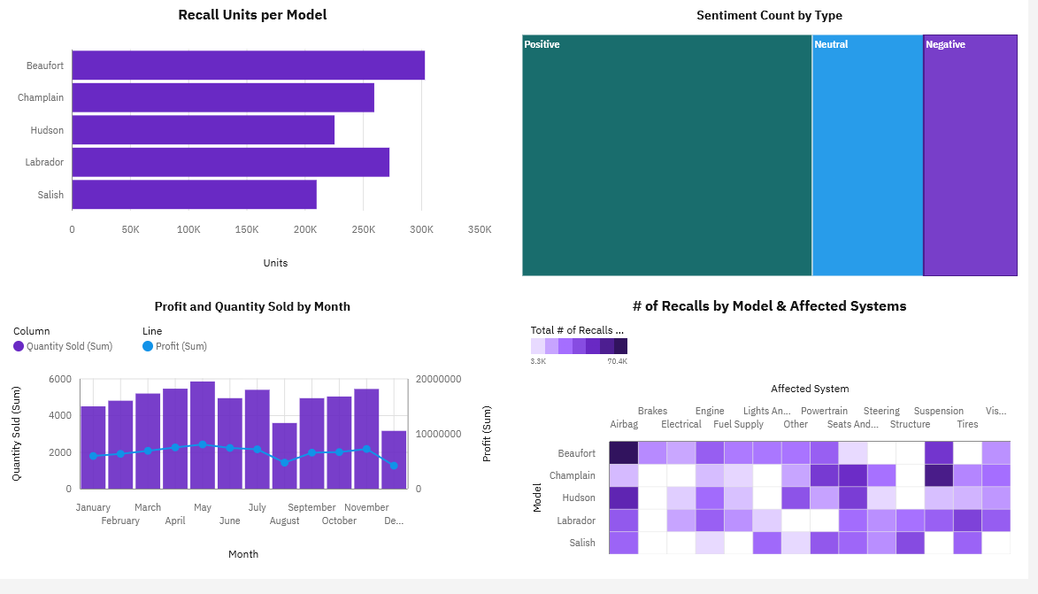
- Create a column chart to capture the number of recalls per model of car
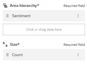
- Create a treemap to capture the customer sentiment by comparing positive, neutral, and negative reviews.
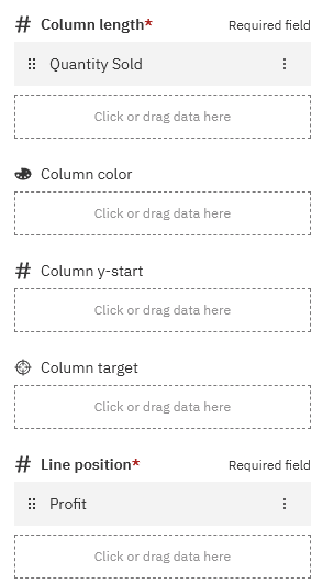
- Create a line and column chart to capture the quantity of cars sold per month compared to the profit.
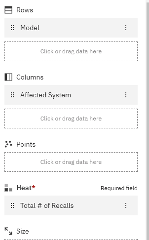
- Create a heatmap (in Cognos) / Pivot table with heatmap (in Looker) to capture the number of recalls by model and affected system
Task 4
Export the dashboard/report as a PDF to your Downloads folder.
Note:
- Have you used the correct visualizations?
- Have you titled the charts correctly?
- Have you formatted the chart elements as directed?
- Have you saved the workbook for grading?
Data
The dataset used in this lab comes from here in the IBM Accelerator Catalog. The Terms of use for such are located at https://developer.ibm.com/terms/ibm-developer-terms-of-use/.
Steps
The dataset used in this final assignment is provided as sample data within your Cognos environment, in a data module called Auto group data module.
Load Data
To load and open the data module:
- On the navigation panel of Cognos Analytics, select Team content.
- Then select Samples.
- Now go to By industry > Automotive > Data.
- Here the sample data used can be found, in a data module called Auto group data module.
- Right-click on Auto group data module and select Create Dashboard.
- Rename the dashboard: Auto Sales Analysis -> use toolbar and save as
Template Dashboards
Create two dashboards as follows:
- One dashboard using the tabbed template that has 4 small rectangles at the top and a large rectangle below - rename this dashboard tab to Sales.
- One dashboard using the 2 x 2 rectangle areas tabbed template - rename this dashboard tab to Service.
Create Charts
CCapture the following KPI metrics as visualizations:
On the Sales dashboard, capture the following KPI metrics:
In the first small rectangle (Panel 1), capture Profit (formatted to 1 decimal place in millions of US dollars) - Drag Profit to center till icon turns blue -> Drop -> Viz Properties Panel -> Viz -> Chart -> Title Type -> none
In the second small rectangle (Panel 2), capture Quantity sold
In the third small rectangle (Panel 3), capture Quantity sold by model (as a bar chart) > CTRL click both Quantity & Model and drag to location
In the fourth small rectangle (Panel 4), capture Average quantity sold
On the Sales dashboard in the large rectangle (Panel 5), display Profit by Dealer ID as a column chart, sorted in ascending order.
On the Service dashboard, capture the following KPI metrics as visualizations:
In the top left area (Panel 1), capture the number of recalls per model of car (as a column chart)
In the top right area (Panel 2), capture the customer sentiment by comparing positive, neutral, and negative reviews (as a treemap) see first image below
In the bottom left area (Panel 3), capture the quantity of cars sold per month compared to the profit (as a line and column chart). See image below
In the bottom right area (Panel 4), capture the number of recalls by model and affected system (as a heat map). This will help us understand if there are any outliers for a given model or a specific system. See image below
To export your dashboard as a PDF, follow instructions below:
On the application toolbar of your dashboard page, click Share icon.
On the Export tab, check Include filters and click Export.
On the Print pop-up page, in the Destination drop-down list, select Save as PDF.
Save the PDF file on your local machine to any location you like (preferably your Downloads folder) for later upload and submission to the coursera platform.
