BI Analytical Tools
- Business intelligence tools, or BI tools, enable data preparation, data mining, data management, and data visualization.
- Today’s analytical tools can be descriptive, prescriptive, or predictive
- BI tools also help organizations harness the power of descriptive, diagnostic, predictive, and prescriptive analytics for operational and strategic decisions
Some of the well-known players in the market are,
- IBM Cognos Analytics, which integrates Watson Analytics that leverages IBM’s artificial intelligence and natural language processing
- Microsoft Power BI, well known for its secure insights
- Tableau is known for powerful visualizations
- Oracle Analytics cloud known for its conversational analytics
- SAP Business Objects known for its intelligent analytics, and
- Tibco Spotfire offers scalability for small and large organizations.
IBM has invested more than 25 billion dollars since 2005 to grow its analytics business. Cognos Analytics is IBM’s AI-fuelled business intelligence and analytics software that supports the entire data analytics lifecycle, from discovery to operations.
Cognos
Cognos Analytics offers a wide range of tools and features, such as
- data modeling capabilities
- data exploration
- advanced analytics features, such as filters
- Natural Language generation with the help of an artificial intelligence-based assistant
- the ability to create interactive dashboards and custom reports that are specific and tailored to your individual users.
After signing up > login > Home page > Visualization Samples > Launch
For future logins go to myibm.ibm.com
My Products
- In this case since we are on a trial basis, there will be one box that appears
- Click on Launch
- You’ll be taken to this page below, then you can proceed

Import Data
Let’s import a csv file onto our machine so we can use to create some reports.
Upload & Create
Click Upload & Create > Drag csv file to window > Next
Data Module
On the next screen let’s convert the csv data file to a new Data Module > click on Data Module > Create
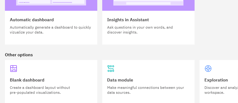
Next screen shows the table with all the columns
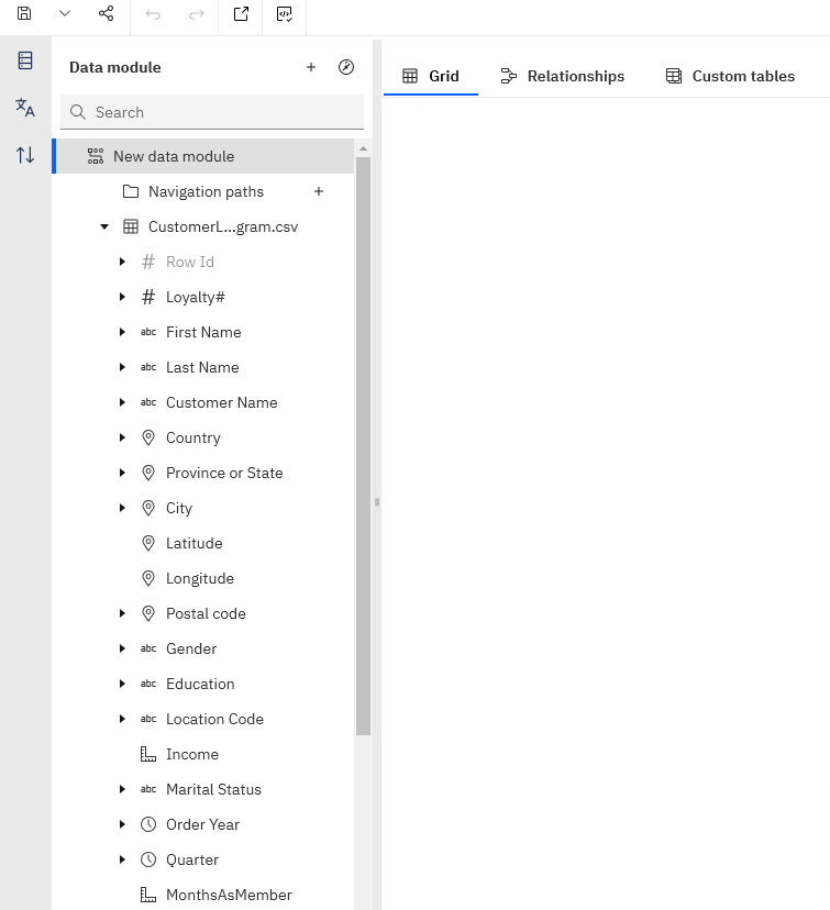
View Data
If you want to preview the data > Click on the name of the data module in the left tree menu

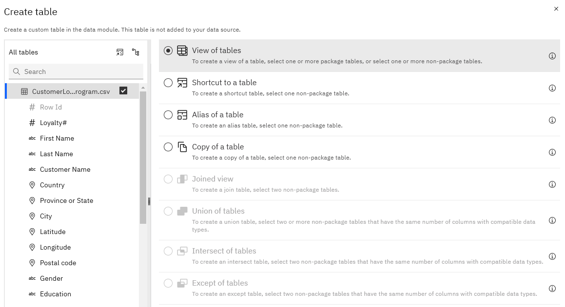
Create Table
From the left burger menu > Content > Choose the data module you want to edit
Click Ok > Next screen > Click on Refresh > Finish
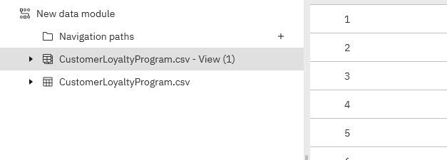
- Now you can see the data in the table
- You will also see in the image below that the view is listed as well as the data module
Save Data Module
Click on the table we just created - View(1) > From the menu Save > Click on Contents Tab > Name it Customer Loyalty Program data module > Save

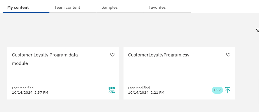
- Navigate to Home > burger menu > Contents > and you see both the data file and the data module
Save Dashb w Template
Burger Menu > Recent > Uploaded data csv file > Next page, Choose a template > Create
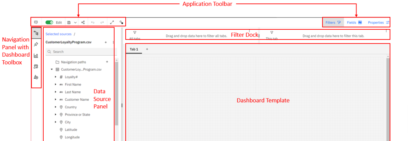
On the application toolbar > Save > Save as > Simple Dashboard > Save
Create Dashboard
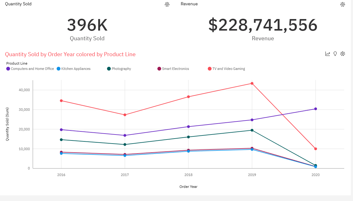
- Left Menu > Sources > Select CustomerLoyaltyProgram.csv as the source
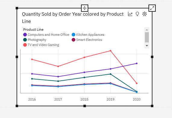
- From the rows in the table > CTRL Select: Product Line & Quantity Sold & Order Year
- Drag them to dashboard the mid lower section till box turns blue
- A line chart is created
Use Template chart from above
- From main menu > Content > Simple Dashboar > Open it
- Continue with steps above
- Drag Quantity Sold to upper left section
- Drag Revenu to upper right section
- Click on Tab 1 > Edit > Change label to: A - Product Sales
Map Chart
Let’s build on the report we created above Simple Dashboard.
Add New Tab
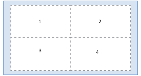
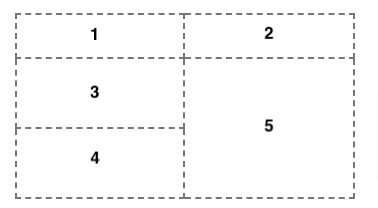
- Add new Tab > Choose 4 box template > Edit Tab Name to: B - Customer > Save Report
- Here is the layout of the boxes in the template
- Select Sources > Choose CustomerLoyaltyProgram.csv if not already
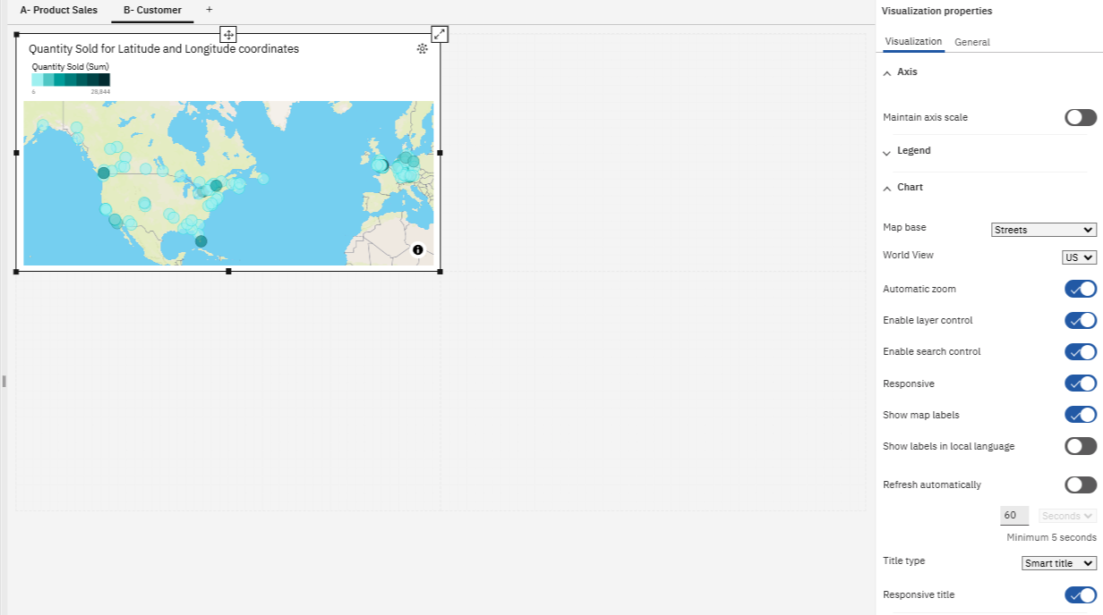
- Drag Latitude, Longitude, Quantity Sold to center of Panel 1
Properties Tab
- Click on the map created in panel 1 if not already in focus
- Open Properties panel on the right side
- Expand Chart > Map base > change to: Streets
Fields Tab
- Add more fields to the report: drag County, Province or State into Locations
- Drag Revenue into the Location color
- Expand Latitude/longitude section and make sure Latitude and Longitude are in their appropriate boxes
- Expand Point section > Drag Quantity Sold into the Point color box

Chart Properties
- Click on the chart to bring it in focus
- Close Fields tab > Click on the chart menu and edit it
- Click on Properties Tab > General > Appearance > Border color > change it to black
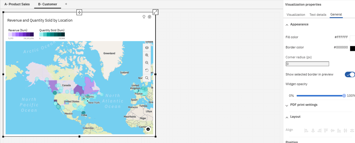
- Bring chart into focus > Properties > Visualization > Regions Layer > change color palette
Radial Chart
- From the navigation panel > Visualization > Radial
- Drag it to panel 2
- Fields Tab > Product Line to Repeat (column)
- Fill in the other boxes as shown below
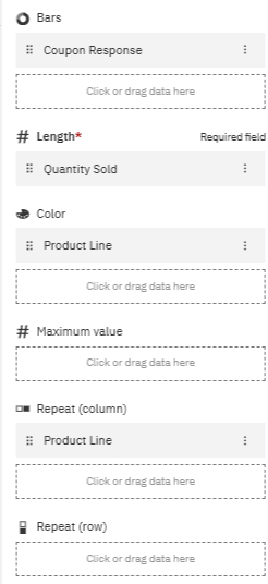
- Select title of the chart and change it to what’s below: Product Line….
- Properties Tab > General > Appearance > Border color > black

Cognos Assistant
- In the upper right side click on Assitant
- Bottom of tab ask: show Quantity Sold and City
- Enter
- and you get
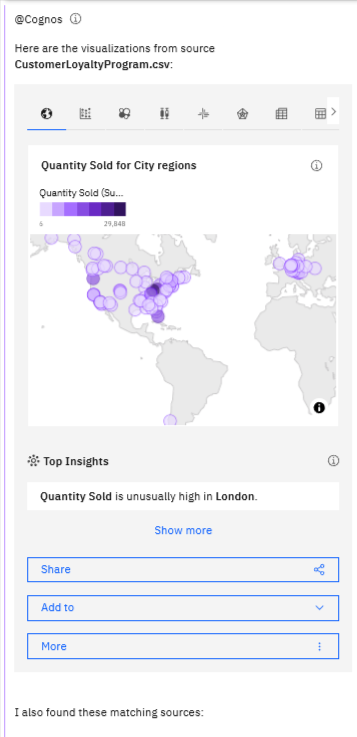
- More > Show related visualizations > on the options above the chart choose bar chart >
- Click and drag visualization to panel 3 or
- Choose the Add to Option to add to current dashboard and it will automatically add it to the next panel that’s empty
- Focus the new chart > Properties > Add black border

Bubble Chart
- In left tab menu > Visualizations > Packed Bubbles
- Drag Product Line to Bubbles…. and the other two fields as shown below
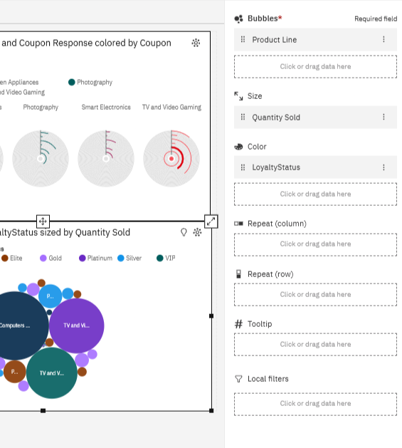
and we now have this
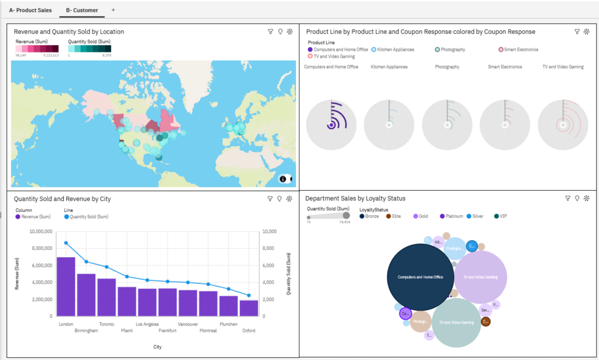
Advanced Dashboard
- Let’s use the same data source as above but create a little more advanced viz
- Click on Burger menu > Content > My Content > click on Loyalty…..csv file
- Template page opens up > choose one
- Save as Advanced Dashboard in the My Content Tab
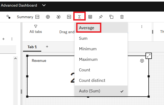
Average Sum & Widget
- From Navigation menu make sure you > Click sources > make sure the correct data is chosen
- Drag Revenue to panel 1
- From toolbar > Sum > Average
- From left pane > Widgets > Choose $ sign > drag to center of panel 1
- Save

Calculations
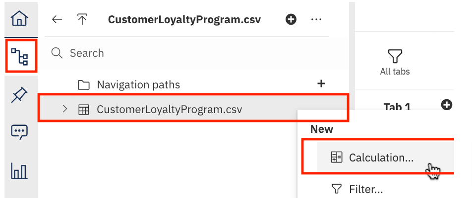
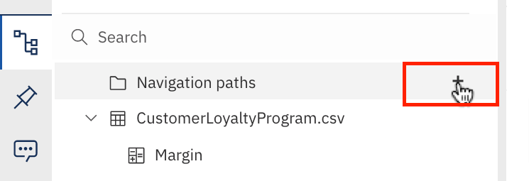
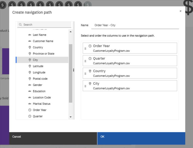
- Left tree menu > choose data source > right click > Calculations > A new blank screen opens
- Create Calculation screen
- Change name to: Margin
- From components panel > drag Unit Sales Price to Expression field in line 1
- Type a space
- Type - sign
- Drag Unit Cost next
- Now we have the calculation shown below
- Click ok to save it
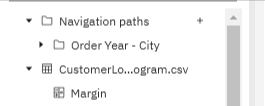
- Now you see the calculation in the left tree panel
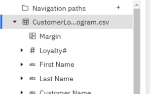
Apply Calculation to Panel
- Drag Margin to panel 2
- Right click chart in panel 2 > choose Summarize > Average
- Right click > format data > currency > $USD
- Save
Exclude Data from Viz
- Select Revenue, Product Line > Drag to panel 3
- Drag Location Code to Color drop zone
- As you approach the panel available fields become visible
- Drop the Location Code in color box
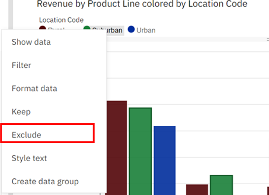
- One of the Location codes is Suburban and shown atop of the chart
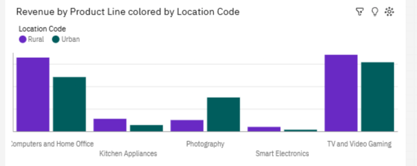
- Right click on Suburban > Choose Exclude
- As you see the chart removes that location
Filter Top | Bottom
- In many instances we only want to view the top/bottom results
- This functionality is built-in
- Drag Quantity Sold and City to panel 4
- Bring the chart into focus
- In the on-demand toolbar > Click on the Map icon > this will allow us to change the chart from map
- Scroll down to Column and choose it
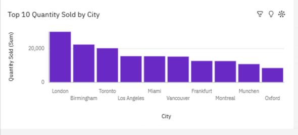
- Right Click the y-axis to Quantity Sold (Sum)
- Choose Top or Bottom > Top 10
- Rename chart to Top 10 Quantity Sold by City
Drill Down
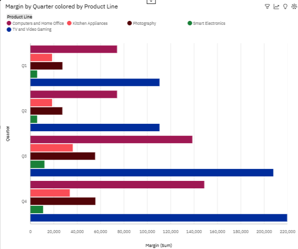
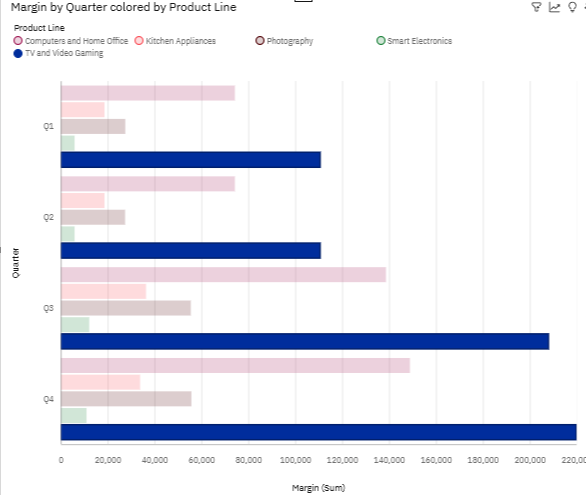
- In the chart above with Quarters or Oder Years… on the left axis
- Click on one of the bar relating to 2016 - Smart Electronics
- Drill Down > this will drill down and highlights just that category for each year/quarter/city…
- When done just right click the same bar that’s highlighted now and choose back
Filter
- We can do a general filtering for the entire report/all charts on the page
- In the upper tab menu > Filters
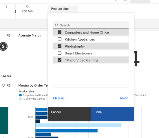
- Drag Product Line to This tab
- Now you see Product Line in the tab
- Click on it and choose as shown below
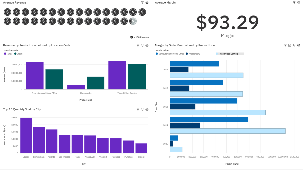
- This will exclude all other non-checked fields from the charts as shown in the last image below
Final chart will be this:
Upload Data
Upload Data
- From main menu > upload data > billing_data.csv
Create Dashboard
- From Contents > Recent > Right click billing_data.csv > Create Dashboard
- Choose template with one large top panel and one narrow lower panel
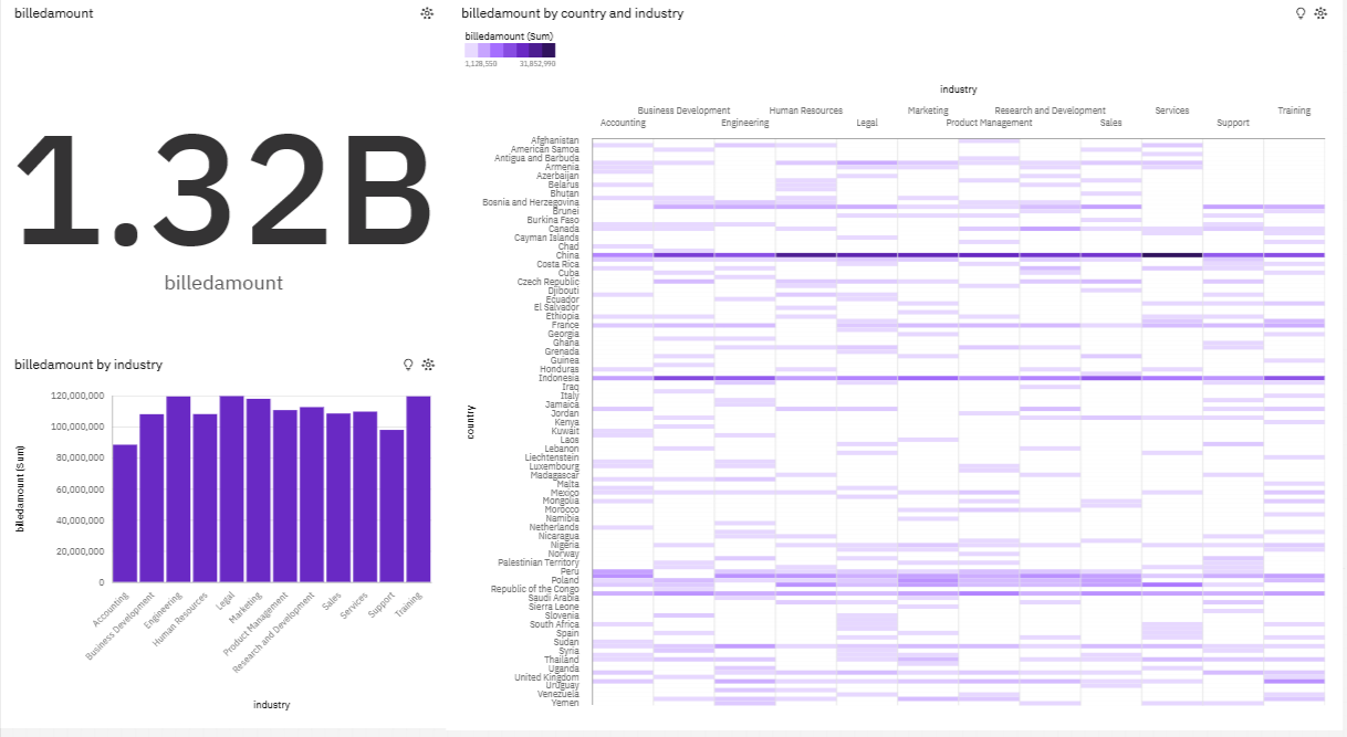
- Drag billedamount > adjust size to not take up the entire top panel
- Drag billedamount & Industry to panel 1 as well
- Drag billedamount, country, industry to panel 1 as well
- All three will look like this
