Google Looker Studio
Google Looker Studio, originally named Google Data Studio is essentially a free cloud based tool that you can use to create easy to read reports. Google Looker Studio enables you to visualize your data using a variety of visualizations, including dashboards and multi page reports.
Go to lookerstudio.google.com if you are logged in to your account you’ll land at the home/welcome page/Recent page
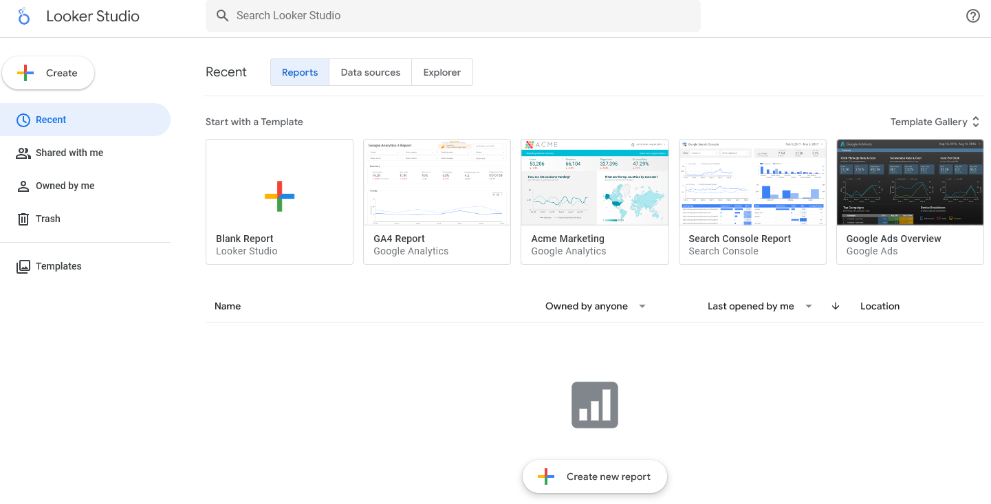
Templates

- If you choose a template you have the option to choose the sample data accompanying it or use your own data
- To start using the template click on Edit & Share this will save it in your Recent tab

Overview
- From Home Page > Create > Report
- From Add Data to Report Page > Select source of data > Choose a Connector to our data source > Upload or
Connectors
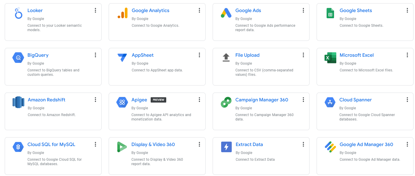
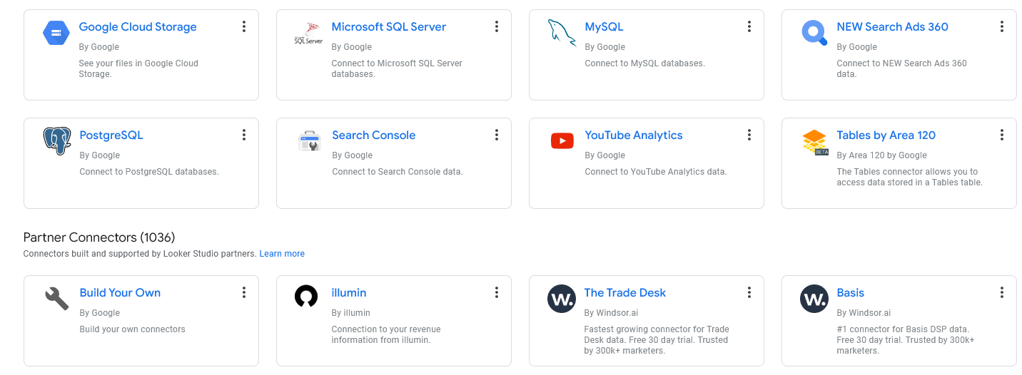
Looker has almost countless ways to connect and connectors:
Connectors are components that connect your underlying data to Looker Studio
For example: To work on data in Excel format, upload the .xls file to your computer, and use the ‘Google Sheets’ connector to create the data source.
Data Sources
Looker Studio can connect to a multitude of data repositories, allowing for real-time data updates and manipulations. Data sources are the components that represent a specific instance of a connector. For example, a connection to a Google Sheets spreadsheet, an SQL server database, or a CSV file.
Connectors are used by a data source to retrieve your data from a given data platform or database product.
- Whenever you create a report, you’ll notice that you are first asked for a data source to connect to

and many more
Create Data Source
- Click Data Sources > File Upload > Drag file from local drive
- Once the upload is done > Connect
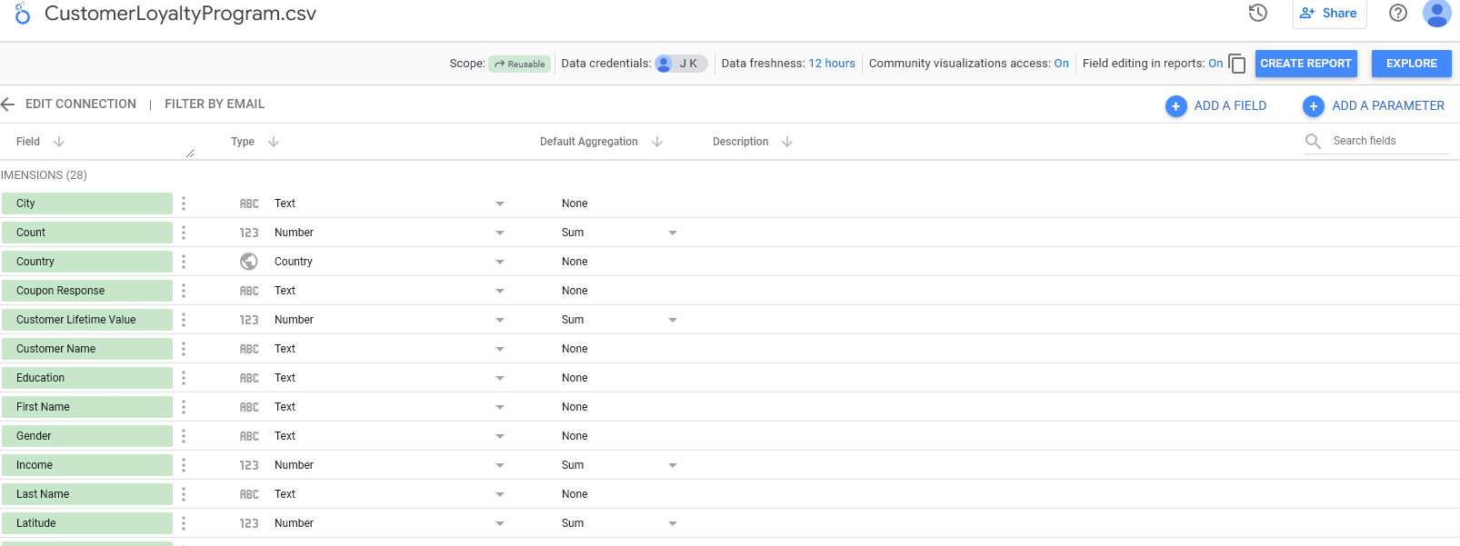
- As you can see in the image, table schema is detailed
- You can even add a field or a parameter
Create Report
- This is one of the ways to create a report which is directly after adding a data source as we did above
- Once you Create Report you’ll see a report page opens up, pre-filled with a table showing the data in the file that was uploaded as well as
- The data rows in the pane to the right along with
- Properties icon and filter bar options on the right side
- The summary table displayed is always shown by default
- Click on the summary table and delete it, proceed to step below to create a report
Calculated Fields
Calculated fields allow you to create new metrics from existing data through custom formulas. This feature is vital for deriving insights that are not directly observable from the raw data.
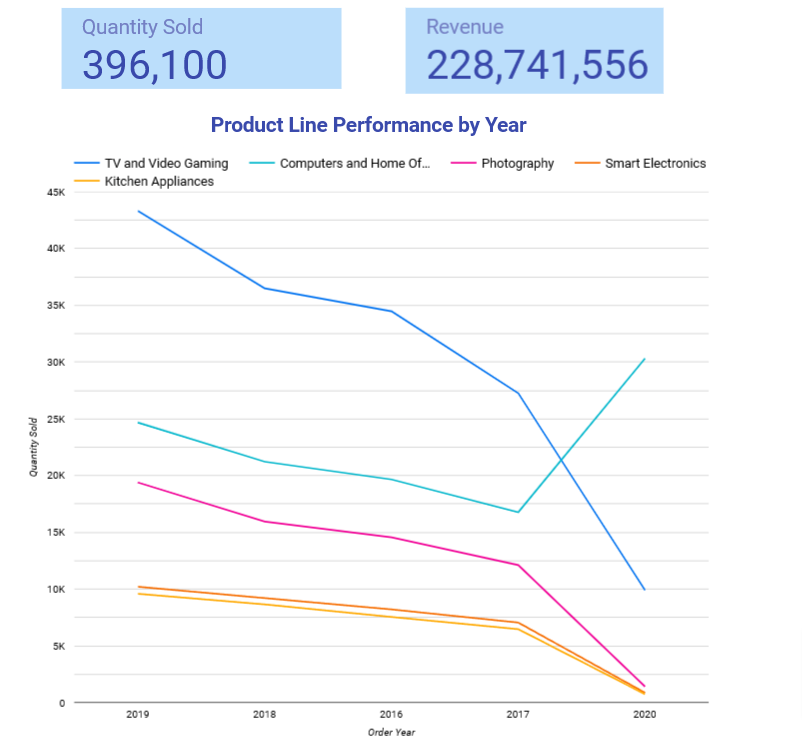
Product Line per Year
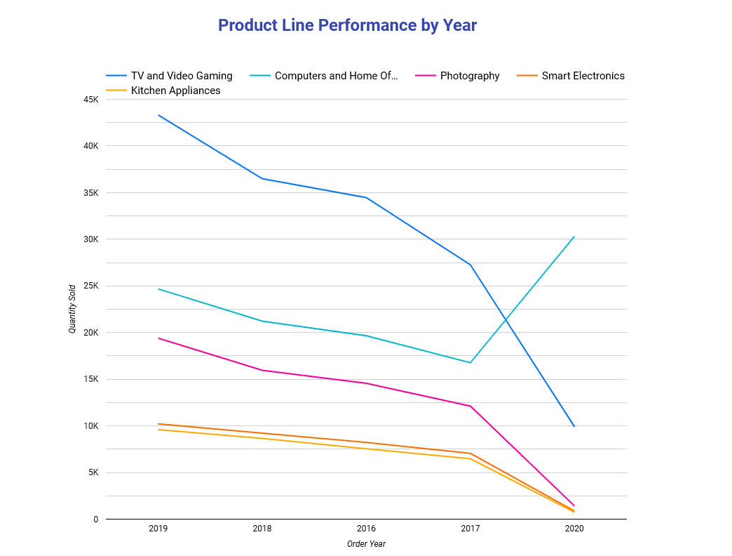
Plot the performance of each product line per year
Create Report
- We’ve already created a data source and uploaded a data file from our local drive as described above in Data Sources
- Let’s say we want to create a report from scratch > From Home page > Recent or My Data Sources > Choose the data source
- Next page will display the schema of the data source > Create Report
- A summary table is shown in a new report > delete it
- Rename report to Simple Dashboard
Add Chart
- From the toolbar > Add a chart > Choose line chart
- A box will appear on the screen > move it to where you want to drop the chart
- Line chart Properties panel is shown once you drop the chart on the report
Add Dimensions
- Since we want to plot the performance of each product line per year we will need
- Order year as one dimension
- Drag Order Year to Dimension, this will be the x-axis
Add Metric
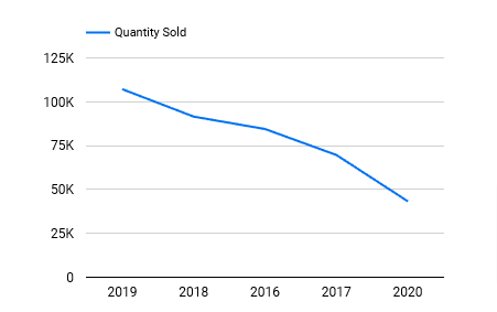
- This is the value we want to see relating to the year we placed in the dimension field
- Drag Quantity Sold to Metric > this will be the y-axis
Breakdown Dimension
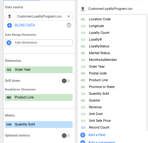
- We want to breakdown the line plotted for each year per product line
- Drag Product Line to Breakdown Dimension box
Axes Titles
- To include the x and y axis labels
- Click on the chart to bring it in focus > Style tab
- Scroll way down and check the boxes to > Show x-axis title > Show y-axis title
Chart Title
- Text icon in the toolbar (square with A in it) > click
- Move the mouse to a position on the report > Click
- Type in the text > a Text Properties panel will open
- Highlight the text > adjust the font, color…. > move the text box to the center
- You’ll see a red line appear when you reach the center of the chart > Drop the title box there
Scorecard
Scorecards summarize key metrics briefly and can be set up to reflect real-time changes in data. They are essential for dashboards used in monitoring performance indicators.
- From toolbar > Add a chart > Scorecard
- Quantity sold will appear in the box by default based on the data
- Style the scorecard to 48pt dark blue
- Add another scorecard > replace the default Record Count with
- Drag Revenue to the Metric field of this second scorecard
- Style to match the first scorecard
Report Settings
Background
- Right click on the canvas > Current Page Settings > Style > Page Background > Choose a color
Size
- Canvas size > play around with dimensions
Add New Page
- From toolbar Add page icon
- In the right panel change the name of page 1 to: Product Sales page 2: Customer
Blend Data
There will be occasions where you will have data spread across multiple different tables that you would like to use in a report. Looker Studio allows you to combine these pieces of data together using the blend data feature.
We’ll apply the steps outlined in the Blending Data section above with real examples. We already downloaded the data files to local drive
In this case let’s consider you have two tables: cust_table.csv - one with customer details such as name, full name, gender, loyalty number and customer_ID and another table: cust_loyalty_table.csv with details on the customer loyalty program, such as cust_ID, Income, Order Year, Quarter, MonthsAsMember, LoyaltyStatus, Product Line, Quantity Sold, Unit Sale Price, Unit Cost, Revenue, and Customer Lifetime Value.
Find Total quantity sold for Males and Females
Add Data
- We need to add the data to Looker
- Click Add Data > File Upload > upload cust_loyalty_table.csv first > when finished >
- Click Add
- Add the other table: cust_table.csv
Mange Resources

- From the toolbar > Resource > Manage added data sources
- Here you can edit, remove… each data source
Add Chart
- Ensure page 2 is selected that would be Customer page
- If you forgot which page it was click on the page navigation menu in the toolbar and it will open a panel with all the pages listed by names
- Choose Columnchart and position it in the upper left corner
- Ignore the default data chosen by Looker
Blend Data
Blend Data: we now get to blending the data since we have the tables we need for our chart
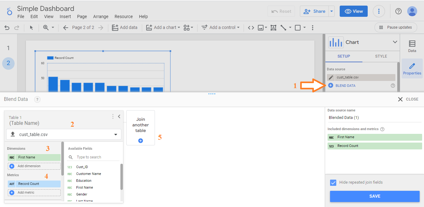
- Click on the column chart to get it in focus
- In the properties pane > Blend Data
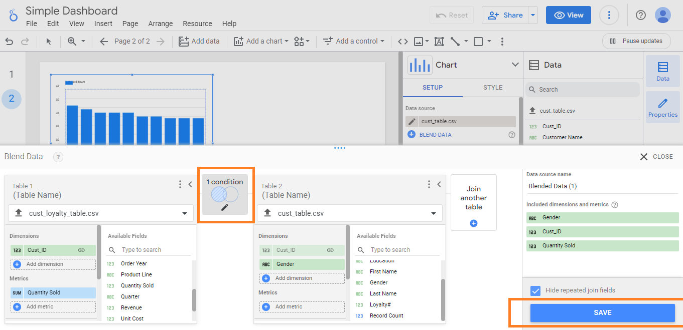
- As you see in the image above a table is already pre-filled
- From Table Name drop down > cust_loyalty_table.csv
- Set Dimension by dragging > Cust_ID
- Set Metric by dragging > Quantity Sole
Join Other Table
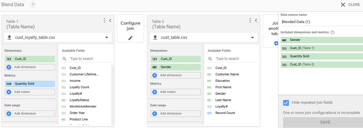
- Now that we have the first table setup, we need to join it to a second table
- Click on Join another table box
- Select cust_table.csv
- Dimension is already defaulted at: Cust_ID
- Add another Dimension by dragging > Gender to Dimension as well
- The screen should look like the image above
- Notice in the far right panel, each field is labeled with it’s own table label: the first table is labeled 123 while the second one is labeled ABC
Join Configuration
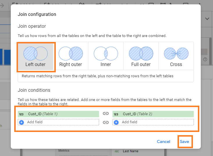
- We need to set the type of join we desire for the two tables
- Click Configure join > Choose Left Outer Join
- This will give us all of the left table: cust_loyalty_table and the intersection with the second table
- Save
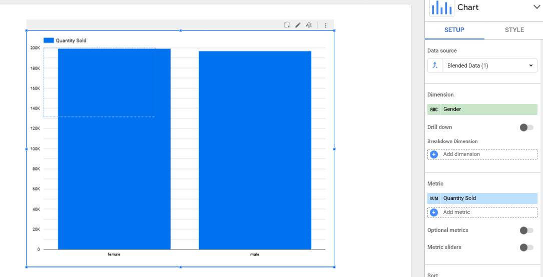
- Once the data is blended > click on the chart (on page 2)
- The chart below is displayed
- As you see the chart is displaying the blended data as shown in the data source field
- We need to set the dimension and metric to answer the question we want answered
- Find Total quantity sold for Males and Females

Dimension & Metric
- Drag Gender to Dimension
- Drag Quantity Sold to Metric
- Wait for the chart to update
Aggregate
- By default SUM is chosen
- To change it, scroll down to Metric, on the left edge you see SUM > Click on it
- Choose Avg
Sort
- Scroll down, by default Descending is chosen
- Change it to Ascending > now you have Male before Female
Controls
You can add controls to your reports to make them more interactive. Controls can either modify or filter the data displayed in a report or provide a way for you to incorporate user input in a report. That allows users to either input data directly into a report or select values or items in the report from a predefined list.
Drop down Toolbar
- You can add controls from the add a control button on the toolbar.
- Controls are split into two types.
- The top subdivision of the menu contains controls that you can use to filter data or configure parameter values, such as drop-down lists, input boxes, sliders, and checkboxes.
- The second subdivision of the menu contains controls that you can use to perform specific functions but can’t configure parameter values such as date ranges, data, and buttons.
- Once you click on the control it will appear in the report and it’s active > expand it and start using it to control the output of the chart > some controls will have a corresponding settings pane that will appear to the right side of the report
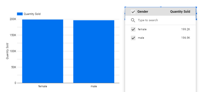
Let’s add a drop-down list to allow the user to choose between male and female
- From the toolbar > Add Control > Choose Drop-down list
- Wait for the chart to update > once done click on the drop-down list to view it > select one or the other
Filters
You can add filters to your report to allow you to control what data is or isn’t displayed in a report.
- Filters are added directly in the chart’s properties pane.
- Look on the right properties pane, scroll down to Add Filters
- In the create filter window, you build your filter by specifying to include or exclude selected fields and then specify the condition and finally the value.
- You can add further or or and clauses to your filters.
- Let’s create a new page > Add page
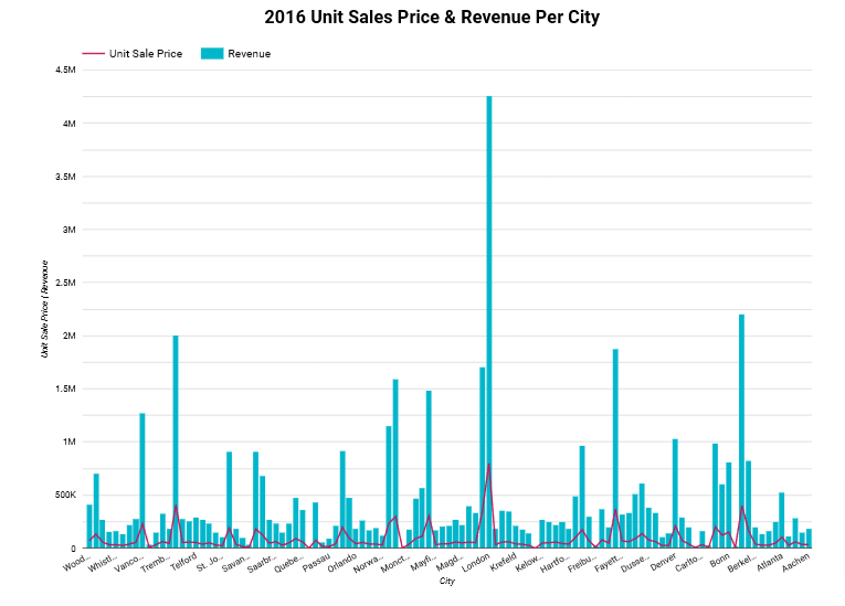
- Add a chart > Line Section > Choose Combo Chart > Place on the top left part
- It will default to the Blended Data since we were working on it last > Change Data Source > CustomerLoyaltyProgram.csv
- Dimension = City
- Metric = Unit Sale Price & Revenue
Dynamic Filtering
Dynamic filters offer a way to alter the data displayed in your dashboard based on user interaction or predefined criteria. This enables users to explore data subsets without altering the underlying datasets.
Sort
- Let’s sort the data by City > drag City to Sort
Filter - Include
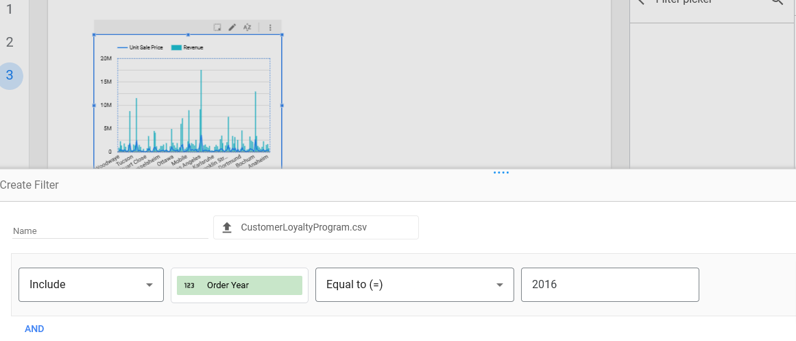
- Let’s now add the filter for this chart
- Bring chart in focus
- Chart Properties Panel > ADD a Filter
- Leave first filter to Include
- Select a field > Order Year
- Select condition > Equal to
- Example > 2016
- Set Title > show axis labels
- As you see the chart will be for 2016 only
Filter - Exclude
- Similar to above but start with Exclude in the first drop-down option
- County = Canada
- Now if we keep both filters on we will have the data for 2016 excluding Canada
- The only problem is the viewer has no control over these filters
These filters are used by the report maker and not visible to the viewer, so the title needs to be adjusted for every combination of filters used which become a pain
Control
- Let’s give the viewer control
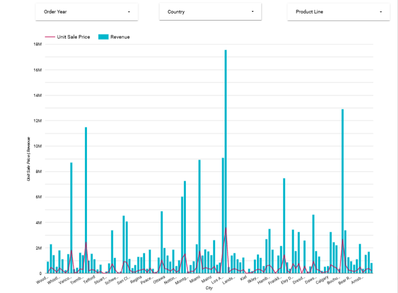
- Add control > Select Fixed-size list
- Drag Product Line > Control field
- Drag Revenue > Metric
- Now you MUST be aware that we are still working with the same chart from above that had 2 filters applied to it
- So the values in this chart are already filtered to 2016 & Canada only
- What if we want to give control over the filters?
- Well we need to remove the filters applied manually by the creator and add two more controls one for Order Year and one for Country, so we’ll end up with 3 controls to filter out the results
Bubble Map
- Add a new page
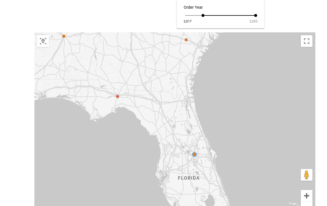
- Add a chart > Google Maps Section > Bubble Map
- Location = City
- Size = Quantity sold
- Color Dimension = Product Line
- Tooltip will display values as you hover over a bubble
Control
- Let’s add a slider control > Add control > select slider
- Control field = Order Year
Heat Map
- Add chart
- In the Google Maps section > Heatmap
- Location = City
- Weight = Quantity Sold
- Style Tab of the properties panel >
Satellite
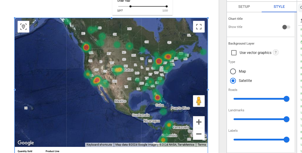
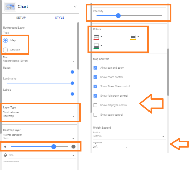
- Satellite backgroung
- Increase the Heatmap layer to 70%
- Increase Intensity to about 40%
Tree Map
- Add new page
- Add Chart > Treemap
- Dimension = Country
- Metric = Quantity Sold
Add Hierarchy
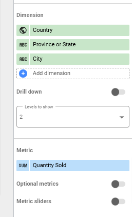
- Let’s add some hierarchy to the tree by adding
- Drag State > Dimension
- Drag Province > Dimension under Country (to maintain the drill down order)
- Drag City > Dimension
- Drag Quantity Sold > Metric
- Click Drill down to activate the drill down option
Add Metrics
- We can also add additional metrics to the treemap
- In the Chart properties pane, under Metric, select the Optional metrics toggle switch.
- From the Data pane, drag Revenue to Optional metrics.
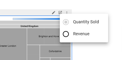
- The menu above the chart will show the options to be selected by the user to display the relevant metric.
- In the top right of the page, click View to see how this control will appear for the end user. Users will be able to view the optional metrics in the treemap.
- Above the treemap, click the Optional metrics icon, then select Revenue.
- Hover over the treemap to view the revenue values for each province.
Calculated Fields
- We’ll go to the home page > Recent > Data Sources > customerLoyaltyProgram.csv
- Click on it > Add Report > Rename Advanced Dashboard
- In the Data Properties Panel > Add a field > Add Calculated Field
- Field Name -> Margin
- Drag Unit Sale Price <space> - <space> Drag Unit Cost
- Save -> You’ll see Margin appear in the fields list
Control
- Add control from toolbar -> Dropdown -> Control Field = City
- Position control box where we want it
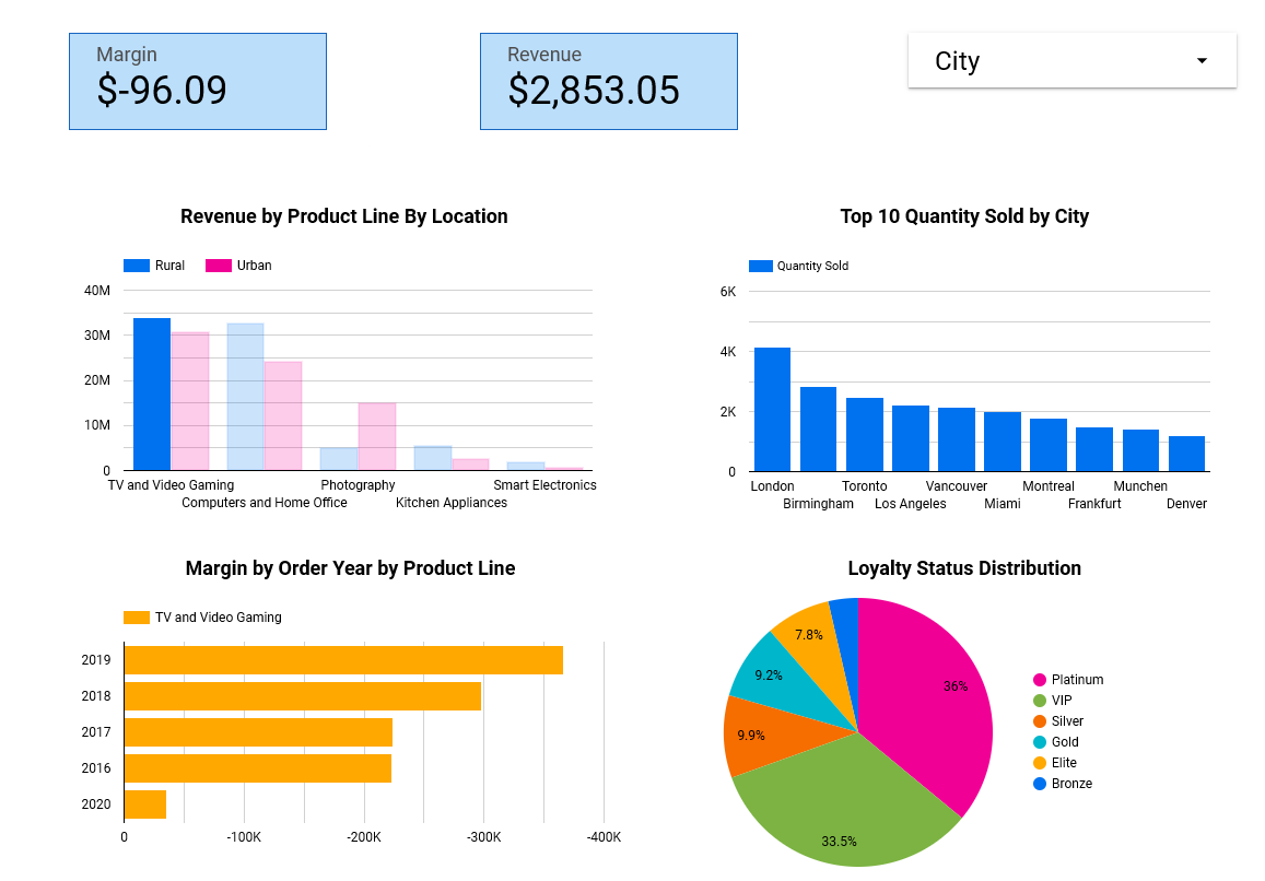
Scorecard
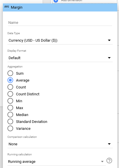
- Add chart -> Scorecard -> Drag Calculated Field Margin -> Metric
- Format the output as follows in the image above
- Add another scorecard -> Revenue
- Edit output to Currency -> Running Average
Columns Chart
We’ll add a bar chart for Revenue By Product Line By Location Code using Drill Down
- Add chart -> Column -> Dimension = Product Line
- Metric = Revenue
- Breakdown Dimension = Location Code
Exclude/Filter
- Let’s add a filter to exclude certain locations
- Let’s exclude Suburban
Top/Bottom Filter
Column Chart
- Create another column chart to view Top/Bottom filtering
- Sort the data in the chart’s data properties
- Limit the number of bars to show top 10 - in the setup section
- Then drag the City field to Dimensions (in the SET UP area)
- Then drag the Quantity Sold field to Metric
- Choose the Descending Sort button to show the top 10
Horiz Bar Chart
Create a chart for Margin by Order Year Colored by Product Line using Drill Down
- Create bar chart
- Then drag the Order Year field to Dimensions (in SET UP area)
- Then drag the Product Line field to Breakdown Dimension
- Then drag the Margin calculated field to Metric
Pie Chart
Create a pie chart of Loyalty Status Distribution
- Add a pie chart to your dashboard
- Then drag the Loyalty Status field to Dimensions (in the SET UP area)
- Then drag the Loyalty# field to Metric
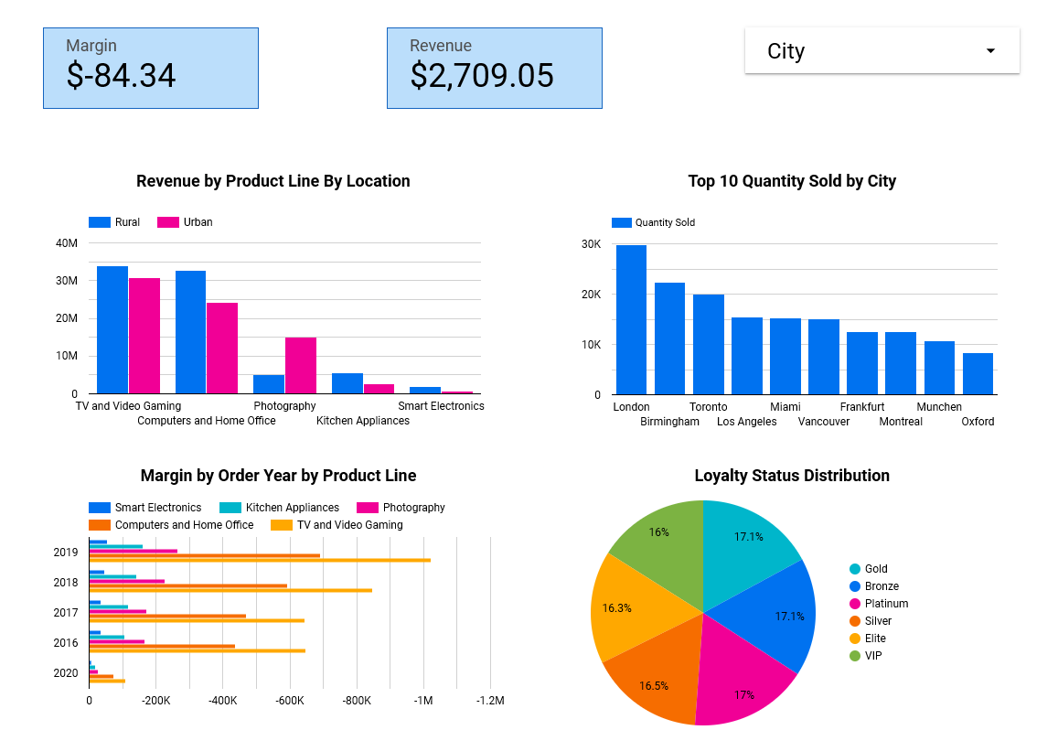
Interactive Dashboard
Feel free to click on the Rural Location Bar in the upper left chart and see how the entire dashboard adjusts by filtering the data
